Guide
Website design ideas and inspiration for a small business
Harrowtech.ai · last checked 13 October 2026
Good website design ideas for a small business come with a reason attached. Seven that hold up, each backed by guidance from GOV.UK, the W3C or Google, and shown on screenshots of two sites we built:
- Answer the visitor’s first questions on the first screen
- One main action, with a button that says what it does
- Keep the keyboard focus outline visible
- Body text that is big, left-aligned and high contrast
- Pictures next to the words they illustrate, with alt text
- Design the phone layout on purpose
- Treat speed as part of the design
The examples are christinahutchings.uk, a counselling practice in Mid Devon, and Jo’s calorie counter, a calorie-tracking website and app. The screenshots were taken on 13 October 2026, at 1440 pixels wide for desktop and 390 pixels wide for a phone. The notes describe only what is on the screenshots.
1. Answer the visitor’s first questions on the first screen
The GOV.UK design principles (first published 3 April 2012, last updated 2 April 2025) list eleven principles. Four carry over to a small business site:
- Start with user needs. Research users rather than assume, and remember “what they ask for isn’t always what they need.”
- Do the hard work to make it simple. “Making something look simple is easy. Making something simple to use is much harder.”
- Understand context. Ask where people are when they use it: “Are they in a library? Are they on a phone?”
- This is for everyone. “Accessible design is good design.”
Put into practice: list the questions a new visitor arrives with (who is this, what do they offer, where are they, can they be trusted, how to get started) and answer all of them before the visitor scrolls. Your own customers’ emails and calls tell you what those questions are.
2. One main action, with a button that says what it does
The GOV.UK Design System button guidance says: “Use a default button for the main call to action on a page. Avoid using multiple default buttons on a single page.” Having more than one main call to action “reduces their impact, and makes it harder for users to know what to do next.” It also says to write button text in sentence case, “describing the action it performs”, such as “Start now” or “Sign in”.
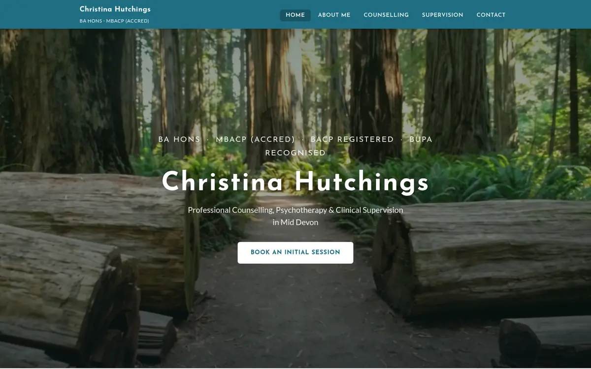
- On the christinahutchings.uk screenshot above there is one button on the first screen, “Book an Initial Session”. The menu items are text links, so nothing competes with it, and the label says exactly what happens next.
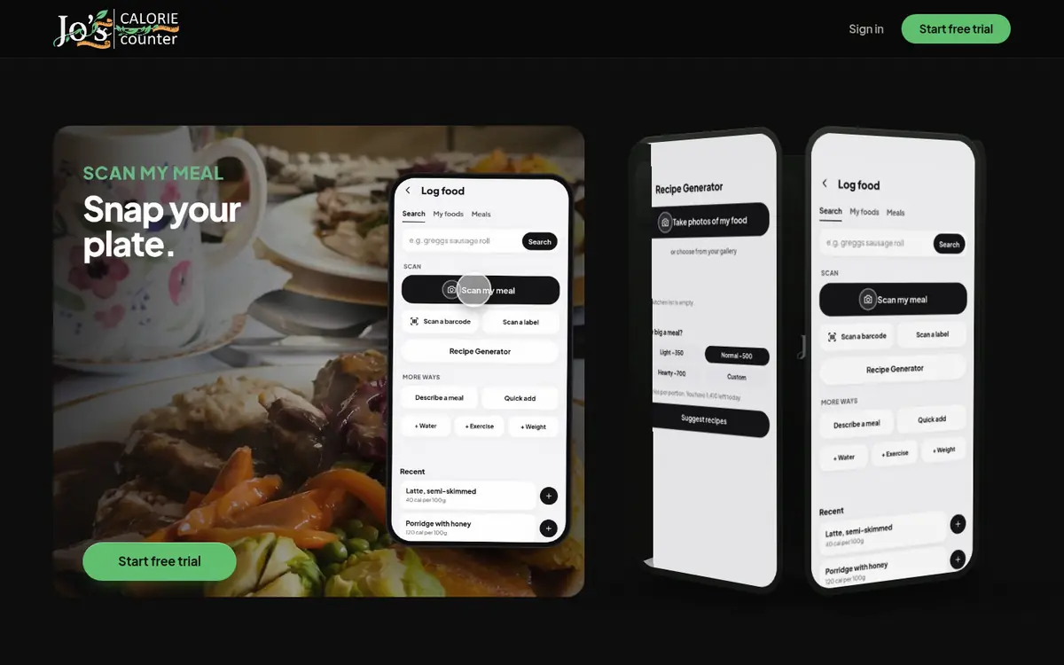
- On Jo’s calorie counter below, the filled green buttons all lead to the same action, “Start free trial”. The other choice, “Sign in”, is plain text, so the visitor is never asked to choose between two main actions.
Put into practice: decide the one thing a visitor should do on each page, make that the only filled button, and label it with the action (“Book an Initial Session”, “Start free trial”) rather than a vague word such as “Submit”. Secondary choices can be links. GOV.UK adds that “Pages with too many calls to action make it hard for users to know what to do next.”
3. Keep the keyboard focus outline visible
“Some people use keyboards or other devices to navigate through a page by jumping from one interactive element to the next,” says the GOV.UK Design System. Focus states “let users know which element they’re currently on”. GOV.UK uses yellow and black with a thick bottom border so the outline shows against any of its background colours. WCAG 2.2 criterion 2.4.7, Focus Visible, requires the keyboard focus indicator to be visible.
Put into practice: you can choose your own colours, but keep the outline. Test it by pressing the Tab key through every page: you should always be able to see where you are. A screenshot cannot show this, so it is not illustrated here.
4. Body text that is big, left-aligned and high contrast
- Size. On the GOV.UK type scale, normal body text (govuk-body) is 19px on both large and small screens. The full scale runs from 16px up to 80px on large screens, and from GOV.UK Frontend v6.0.0 it is larger on small screens.
- Alignment. GOV.UK says to “usually left-align body copy text” and not to justify it, because justifying “creates wider spaces between words, which can make the text hard to read.”
- Contrast. WCAG 2.2 criterion 1.4.3 asks for a contrast ratio of at least 4.5:1 between text and its background, and 3:1 for large text. GOV.UK notes the 2.2 criterion is the same as in WCAG 2.1.
Both example sites put white text over a darkened photograph. With a photo behind the words, the contrast changes from one part of the image to the next, so check the ratio against the lightest area behind the text, not the average.
5. Pictures next to the words they illustrate, with alt text
WCAG criterion 1.1.1 says non-text content needs “a text alternative that serves the equivalent purpose”, with some exceptions such as decoration. Google’s image guidance (last updated 2 March 2026) adds:
- “The most important attribute when it comes to providing more metadata for an image is the alt text”. Its best example is “Dalmatian puppy playing fetch”; filling alt text with keywords “results in a negative user experience and may cause your site to be seen as spam.”
- Place images “near relevant text”. The Jo’s calorie counter screenshot above is a direct example: the app screen with the “Scan my meal” button sits next to the words “Snap your plate.”
- Use short, descriptive file names, and avoid generic ones such as image1.jpg or pic.gif where possible.
- WebP is one of the formats Google Search supports, along with JPEG, PNG, GIF, BMP, SVG and AVIF.
- “Images are often the largest contributor to overall page size, which can make pages slow and expensive to load.” Choosing fewer, smaller pictures is a speed decision as much as a design one.
6. Design the phone layout on purpose
Google says it “uses the mobile version of a site’s content, crawled with the smartphone agent, for indexing and ranking” (page last updated 10 December 2025). The phone design can differ from desktop, “for example, moving content into accordions or tabs”, as long as the content is equivalent. Two WCAG 2.2 criteria set useful limits:
- Reflow (1.4.10). Content works without scrolling in two directions at a width equivalent to 320 CSS pixels.
- Target size, minimum (2.5.8). Things you tap are at least 24 by 24 CSS pixels, with some exceptions.
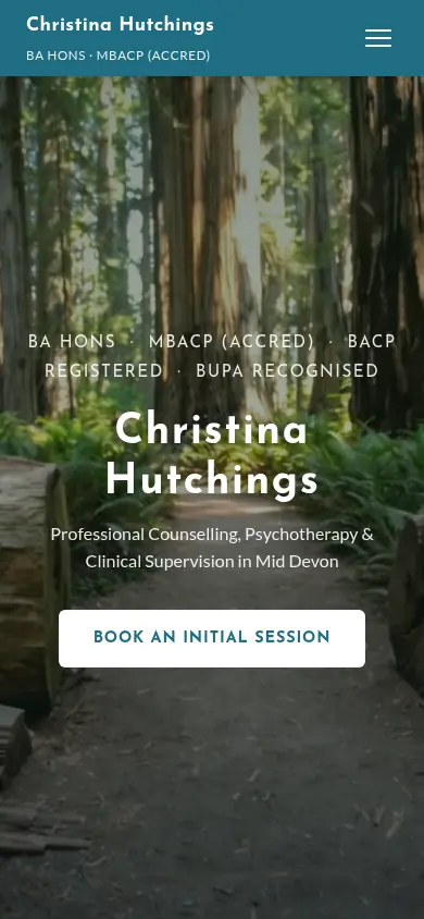
- christinahutchings.uk. In place of the five desktop menu items there is a three-line menu icon. The name breaks onto two lines, and the credentials, services line and button all still fit on the first screen. The button measures about 280 by 50 pixels in this screenshot, well above the 24 by 24 minimum.
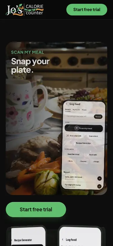
- Jo’s calorie counter. The header keeps only the logo and “Start free trial”. The heading, photo and app screen stack into one panel, with the main button directly under it. The other phone screens move below, where the visitor reaches them by scrolling.
Google’s page experience guidance also asks: “Do your pages avoid using intrusive interstitials?” It links to advice on avoiding interstitials “that can make content less accessible”.
7. Treat speed as part of the design
web.dev names three Core Web Vitals and a “good” level for each, measured at the 75th percentile of page loads, split by mobile and desktop:
| Loading (LCP) | Largest Contentful Paint within 2.5 seconds of the page starting to load. |
|---|---|
| Interactivity (INP) | Interaction to Next Paint of 200 milliseconds or less. |
| Visual stability (CLS) | Cumulative Layout Shift of 0.1 or less. |
That page was last updated 31 October 2024. Google’s page experience page (last updated 22 September 2026) says Core Web Vitals “are used by our ranking systems”. It also says good scores do not guarantee top rankings, and that chasing a perfect score just for SEO “may not be the best use of your time.” Pictures are often the heaviest part of a page (see idea 5), so weigh each one against what it does for the visitor.
Using these ideas when you look at other sites
When a site catches your eye, run it through the same seven checks: does the first screen answer who, what, where and how to start; is there one main button that says what it does; can you see where you are when you press Tab; is the body text large, left-aligned and readable against its background; do the pictures sit next to the words they explain; does the phone layout work at 320 pixels wide; and does it load quickly on your phone. A site can look striking and still fail several of them. Taste still decides colour, photography and tone, and none of the sources here settles that for you.
If you want these ideas applied to your own site, a redesign of your existing five-page site starts from £950 and we write the words. See what a website costs in the UK.
What this guide does not cover
It does not cover fashions, colour palettes or branding. The GOV.UK sources are written for government services, not marketing sites, so treat them as tested principles, not rules you must follow. For choosing who builds your site see website design in the UK, and for the legal and technical checks before going live see the website launch checklist. More guides: all Harrowtech.ai guides.
Sources, all read 13 October 2026
- GOV.UK: Government design principles
- GOV.UK Design System: Button
- GOV.UK Design System: Understanding focus state styles
- GOV.UK Design System: Type scale
- GOV.UK Design System: Font override classes
- GOV.UK Design System: Colour
- W3C: How to Meet WCAG 2.2 (quick reference)
- Google Search Central: Image SEO best practices
- web.dev: Web Vitals
- Google Search Central: Understanding page experience
- Google Search Central: Mobile site and mobile-first indexing best practices
- The two example sites, screenshots taken 13 October 2026: christinahutchings.uk and joscaloriecounter.com